scanatron
role —
project lead
ux researcher
timeline —
january -
march 2022
skills —
ux design
ux research
card sorting
graphic design
user interview
tools —
figma
figjam
project overview —
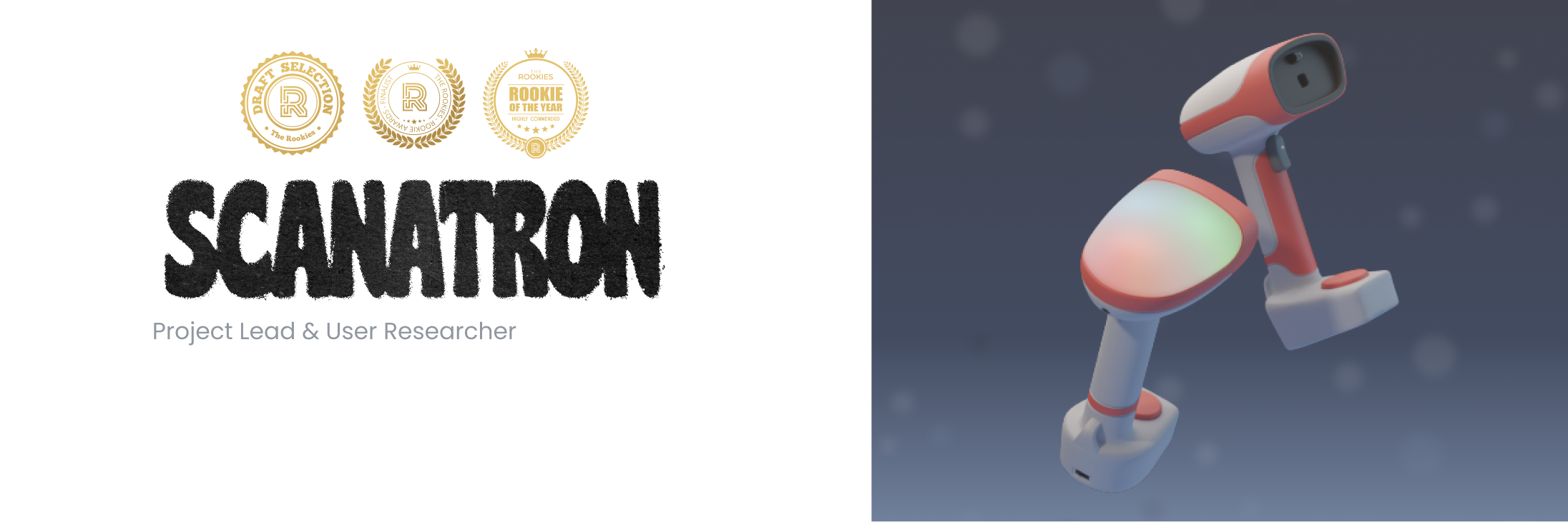
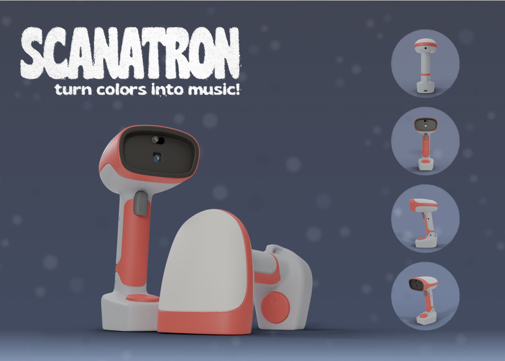
Scanatron bridges the gap for kids who want to explore music without knowing music theory. It is designed to inspire kids through a unique interaction with music and colors to explore music. We developed a unique interaction between everyday objects and childhood curiosity.
final concepts —
problem —
With the rise of technology and kids growing up with a curiosity about sound and music,
parents are currently trying to figure out what is the best way to let their kids explore
their hobbies and empower curiosity. Allowing children to follow and create their own experiences,
allows them to create their own sense of understanding of music and their own unique musical experience.
Kids don’t have any music-based creative outlet that they can use without extensive prior knowledge,
especially without a screen attached.
Saturated with standard switch and button interactions, in the form of the piano keys. It helps familiarize
kids to more advanced music later in life, but we think that with all the sensors avalible to use through
Ardino, we could find a more interesting interaction with notes and patterns to get children
excited about
music.
How might we inspire creativity through unique interactions with music, without the need for music theory knowledge?
goals —
To give a child the ability to create and control a unique musical experience by…
- Use of tech to facilitate creative, musical interactions
- A toy that will keep a child engaged and excited
- Output sounds sonically pleasing
marketing research —
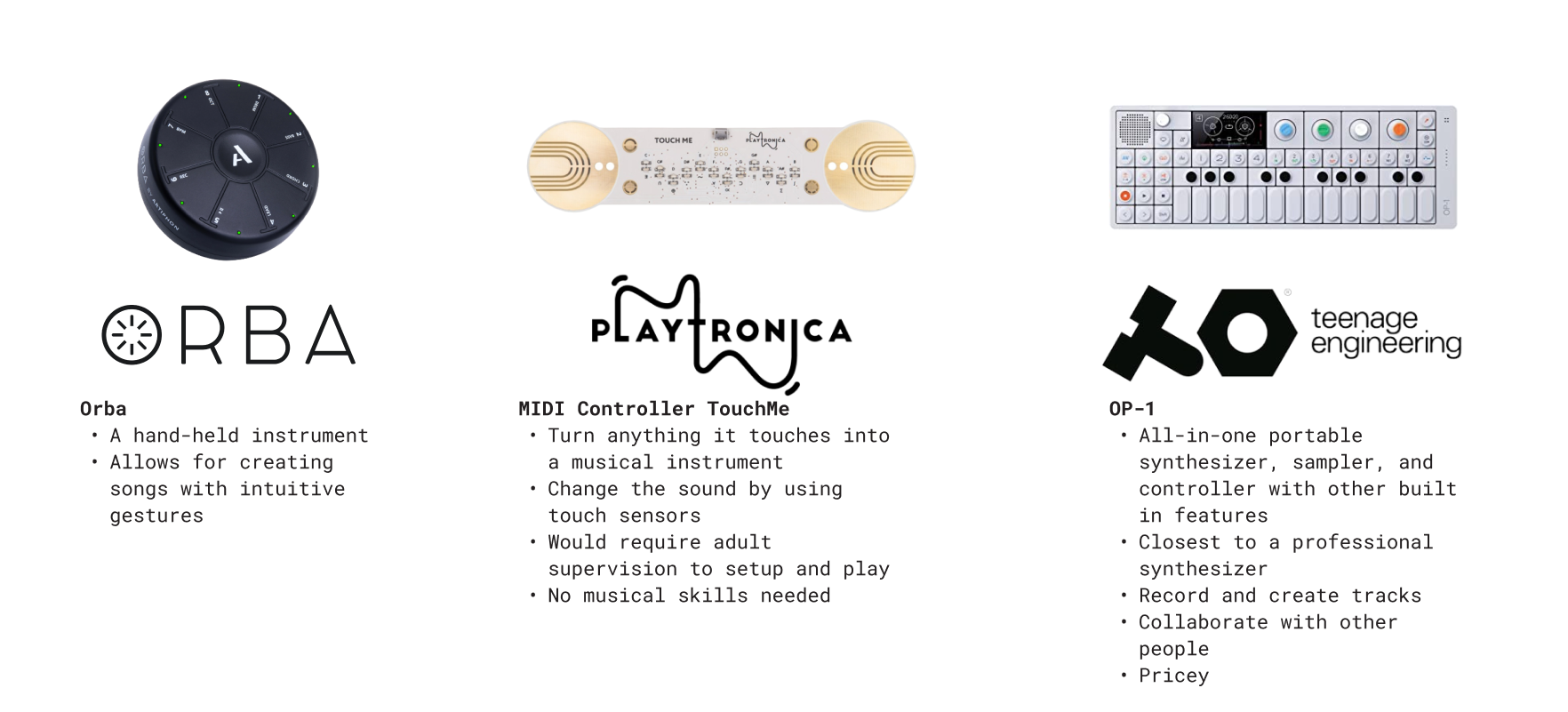
Here are quick takeaways:
-
Complexity, price, age correlate to the level of music education
-
Size of the kids toy
user testing —
Objectives:
-
Understand of what type of button/switch people prefer for a scanner-type toy (i.e. a trigger and push button) and what shape they think is the best to fit the form
-
Ask people to recall and define what rhythm, melody, and harmony
-
Identify if users have a color assoication with rhythm, melody, and harmony
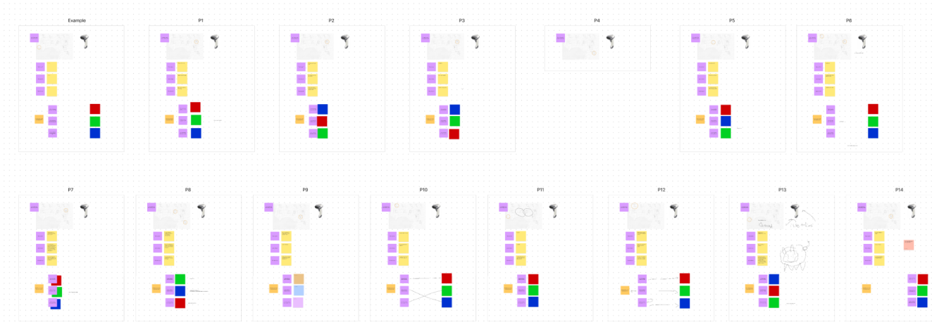
After a round the workshop, we analyzed the results to farther develop our concept
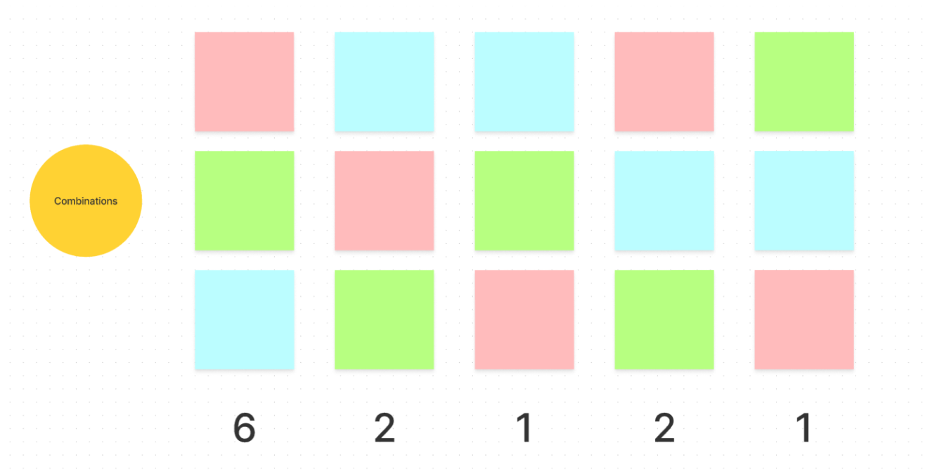
Results of color assoication with musical terms
Results:
- With the various responses, the most common combination is RGB where rhythm is red, melody is green, and harmony is blue
- When asked about these musical terms, people with various levels of music education struggled to recall and give a definition, so we needed to created a toy that removes the fiction of knowing about music and make it fun.
physical prototype —
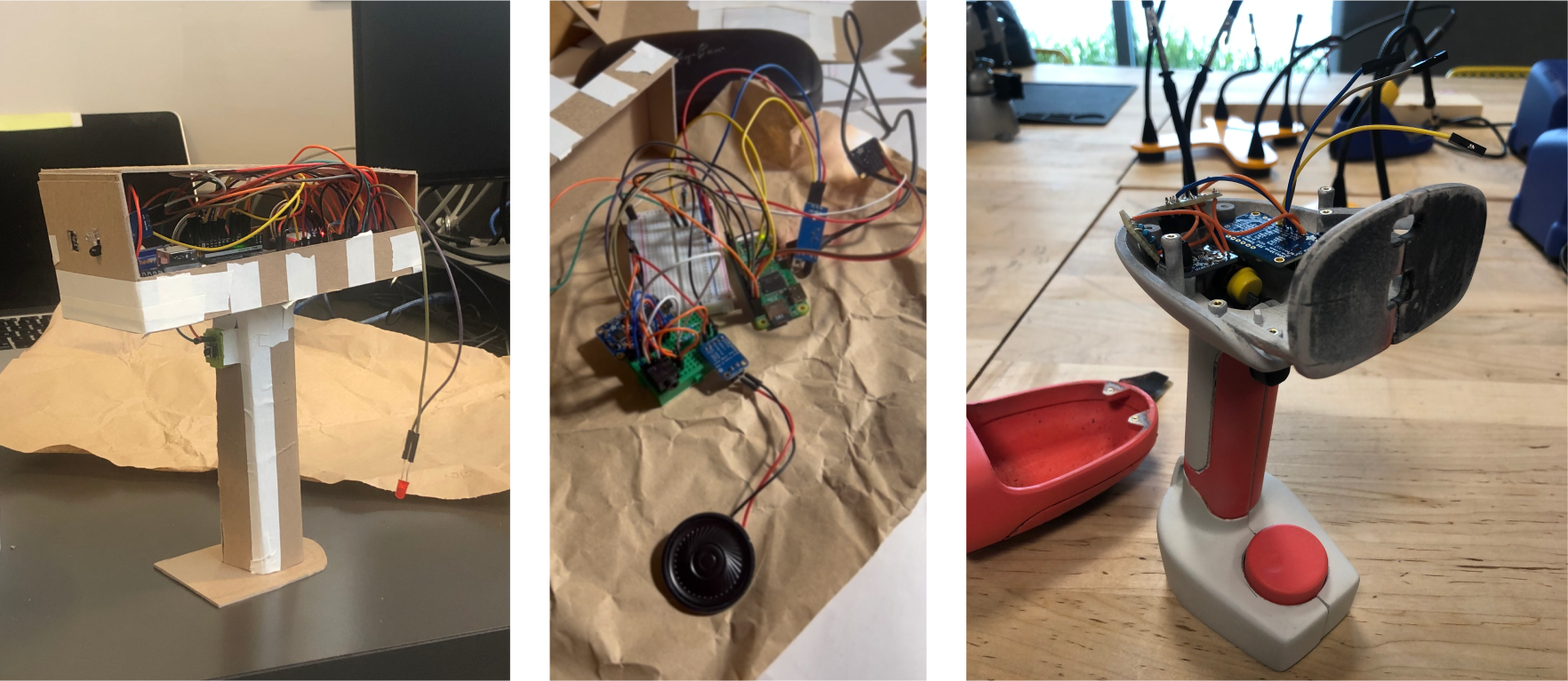
Progress shots of Scantron from our first lofi prototype, simplified midfi, to a wip hifi
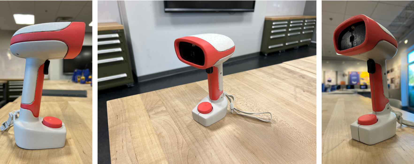
Final turnaround of Scanatron
packaging design —
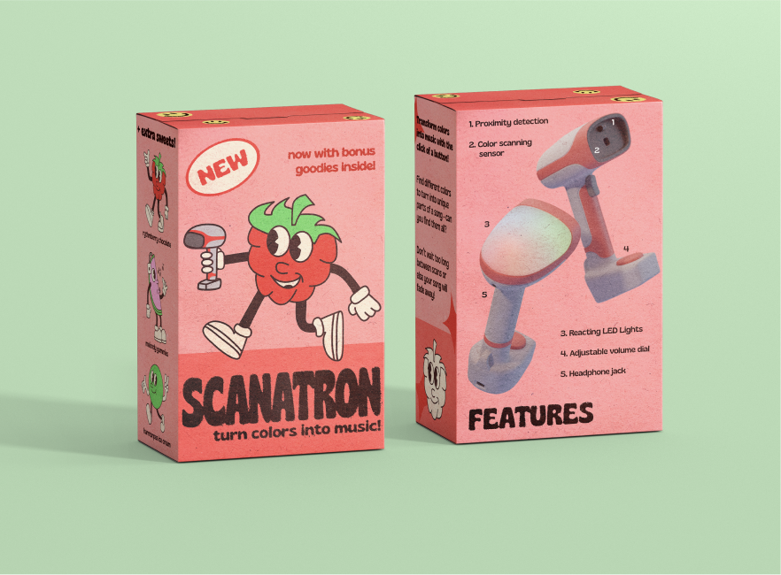
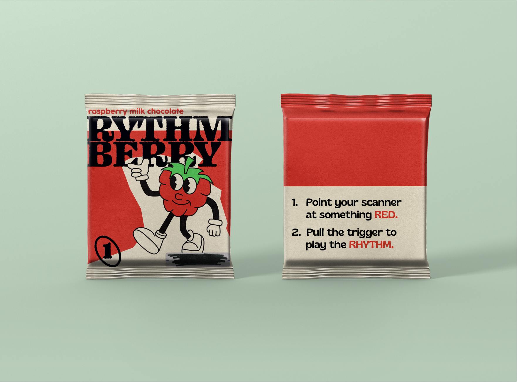
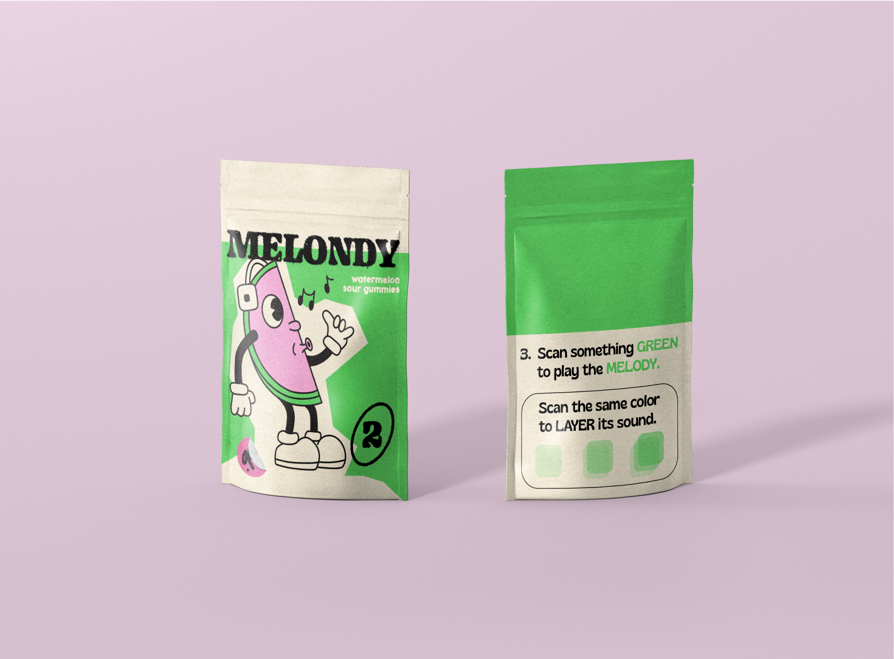
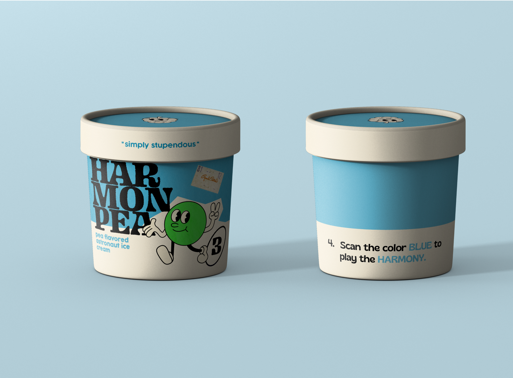
takeaways —
Collaborating with asynchronous team
Since we work as an asynchronous team, we had to trust each other finish the tasks that I assign them and communicate with each other if any roadblocks occur and adjust the timeline from there.
Exploring the unknown
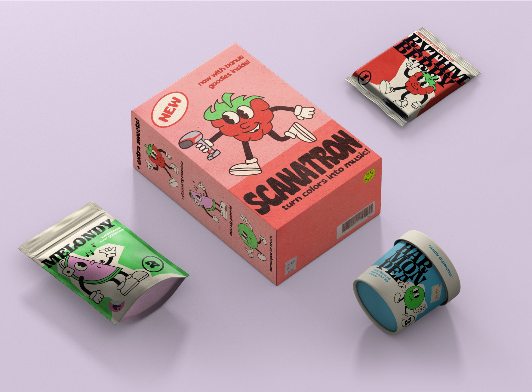
During this class, we were tasked to learn Arduino and create a physical product which is different from our other classes where we mostly land on more digital solutions. I learned the limiations of a physical solutions, but had a lot of fun collaborating on the form factor. We wanted to play around with the onboarding process and visual language of the packaging by referencing 1930s cartoon style.
