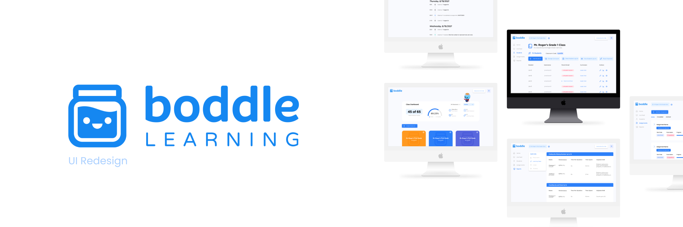
boddle learning internship: ui redesign
role —
user experience (ux)
design intern
timeline —
june - august 2021
skills —
ux design
tools —
figma
notion
project overview —
In Summer 2021, I had an opportunity to work for Boddle Learning, an Edtech startup, focused on creating a gamified experience for kids learning math in K-6th grade. How might we redesign the teachers’ administration point of view to provide necessary classroom-level and student-level information at a glance?
objective —
My goal of the project was to
improve the teacher’s experience while navigating Boddle Learning’s teacher dashboard
to enable them to gain insights on their students.
Three main goals:
- Redefine and build a new visual language for the dashboard
- Create a landing page that has information more at a glance
- Reorganize the information architecture
problem —
When teachers are trying to view insights of their class and how their students are doing, the teachers have to click through many screens to get to insights. They value being able to see information at a glance and being able to see the information quickly.
usability results —
I was given information from our useability testing…
- Teachers were able to find the information (ex. Progress reports, usage reports, etc.), however, they need to find all the information once they open Boddle Learning
- Usage report need adjustments to the information being presented
lofi wireframes —
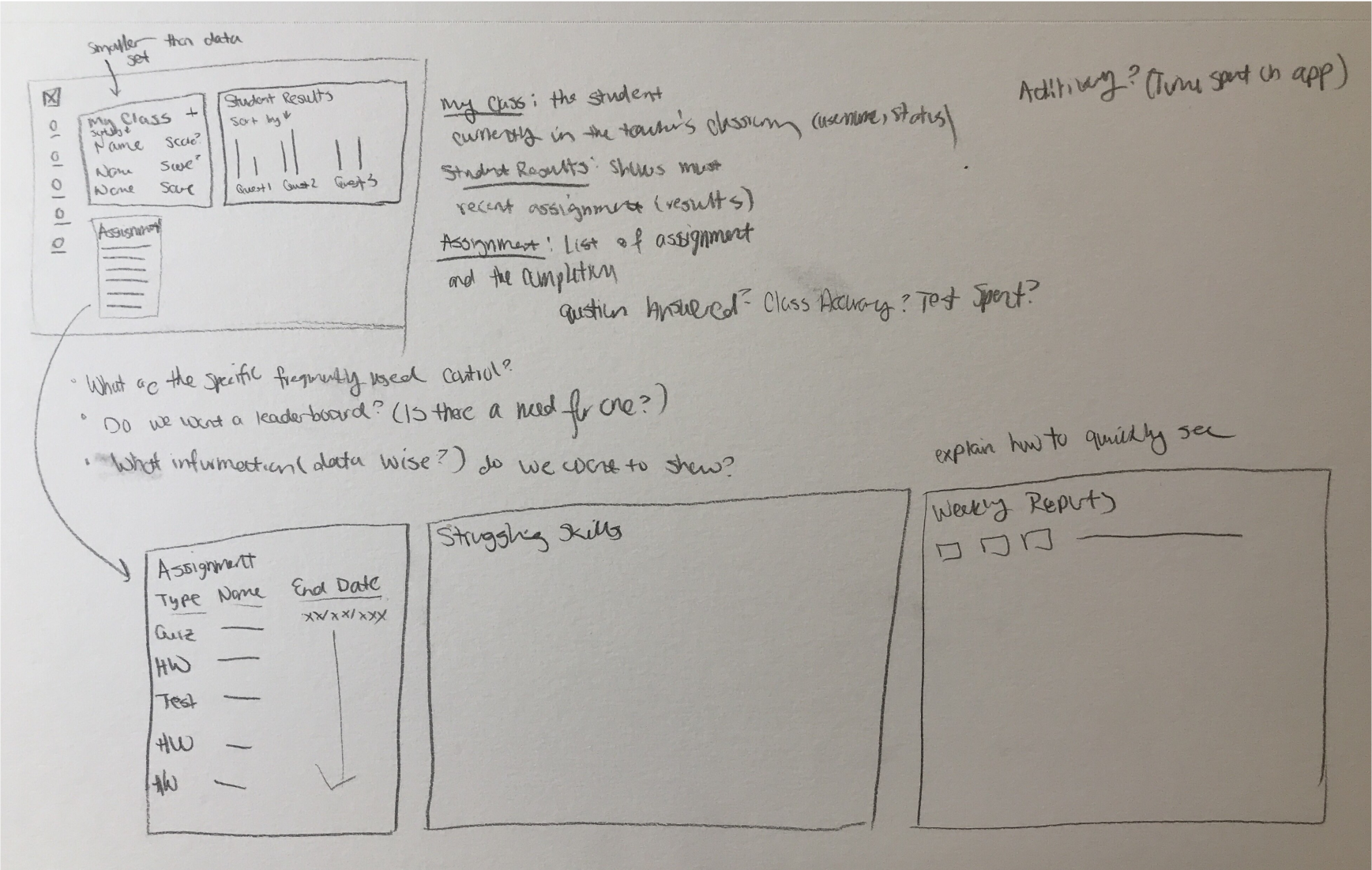
I started off by understand and sketching out the current dashboard. I wrote the descriptions that were needed such as the assignment progress.
The main page I’ll be focusing on is the classroom page as it laid the foundation for the rest of the pages I created during this internship.
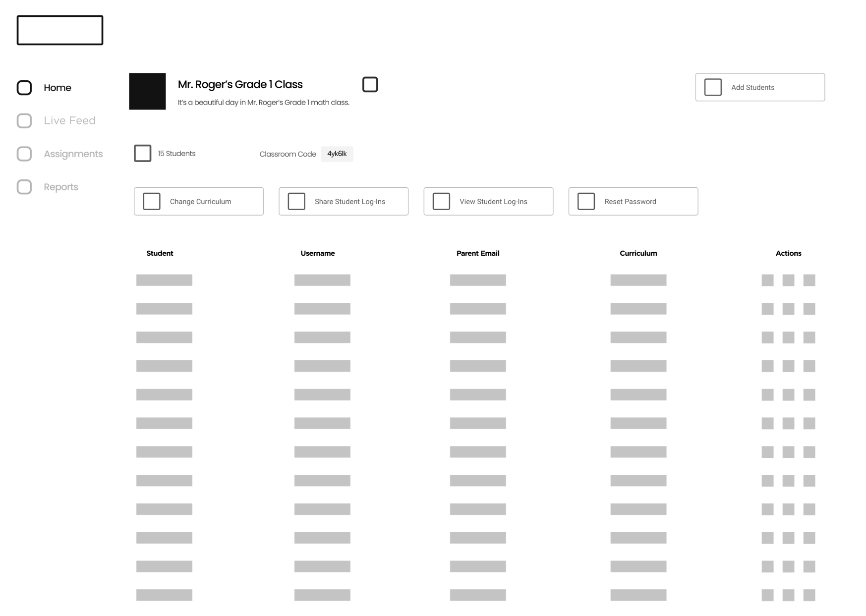
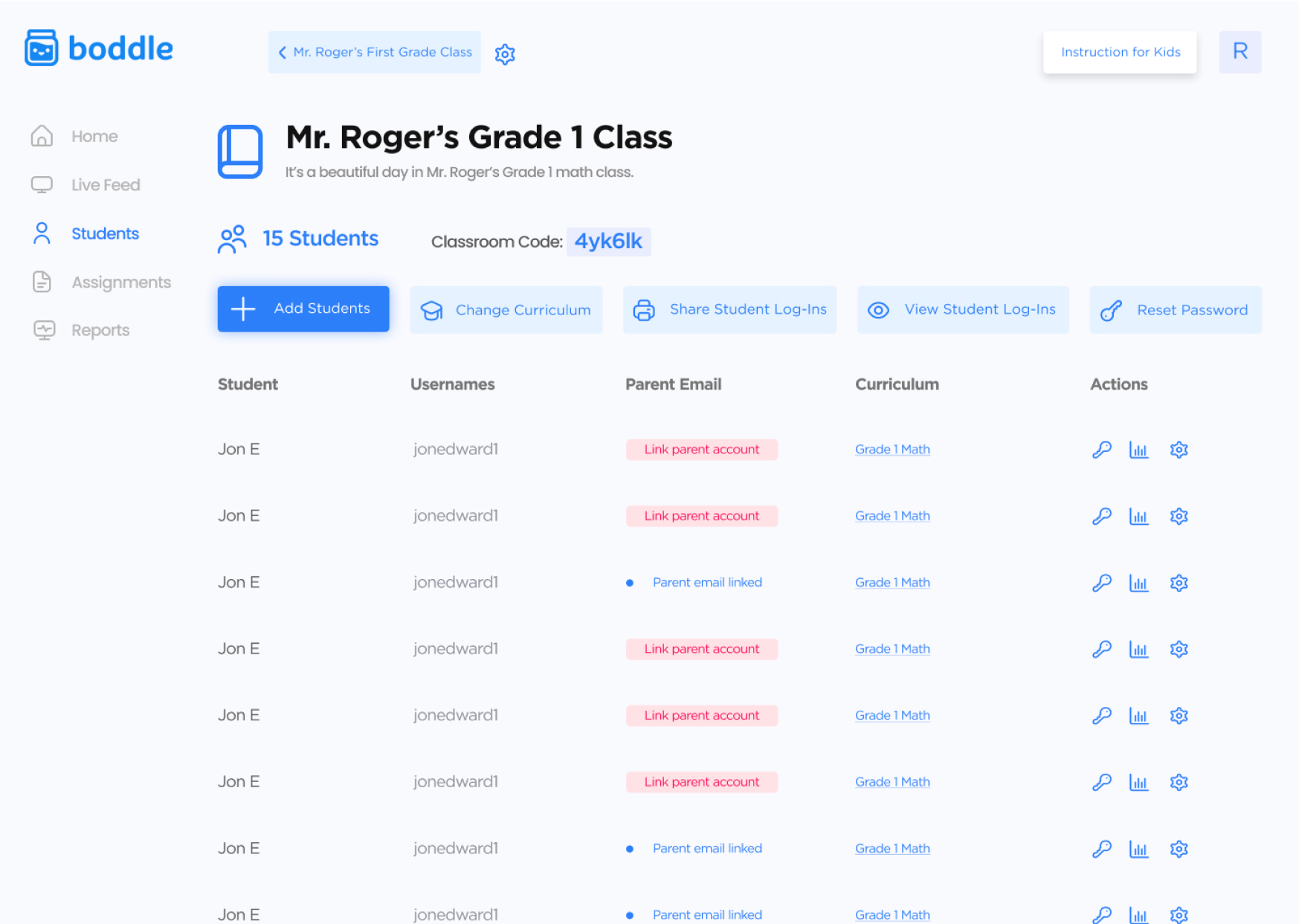
midfi wireframes —
When teachers clicked into the classroom, we wanted them to see their student’s name, username, if the parents have connected their email to their kid’s account, grade level, and quick access to actions.
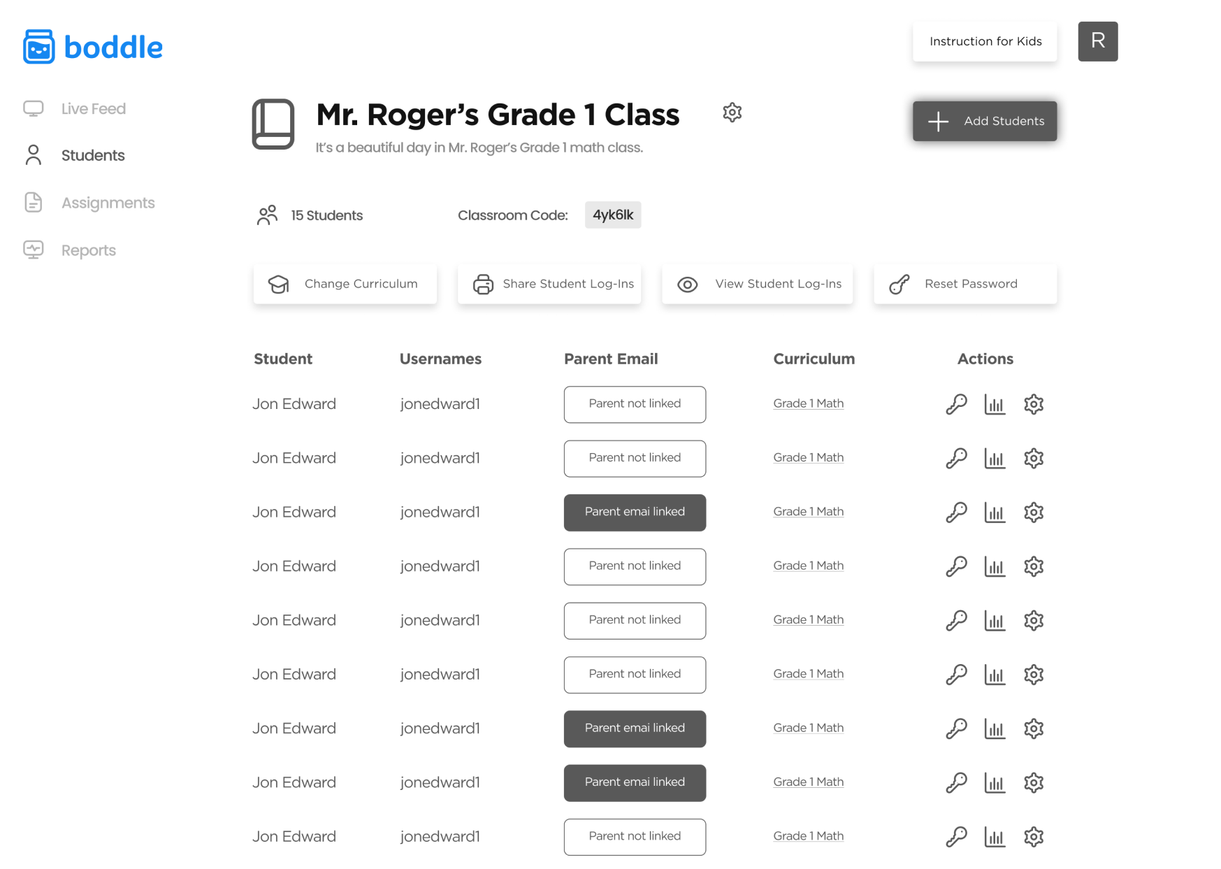
hifi wireframes —
From midfi to highfi, we adjusted the CTA to be adding the students and remind parents to link their emails to their kid’s accounts. In addition to adjusting the navigation bar and button placements.
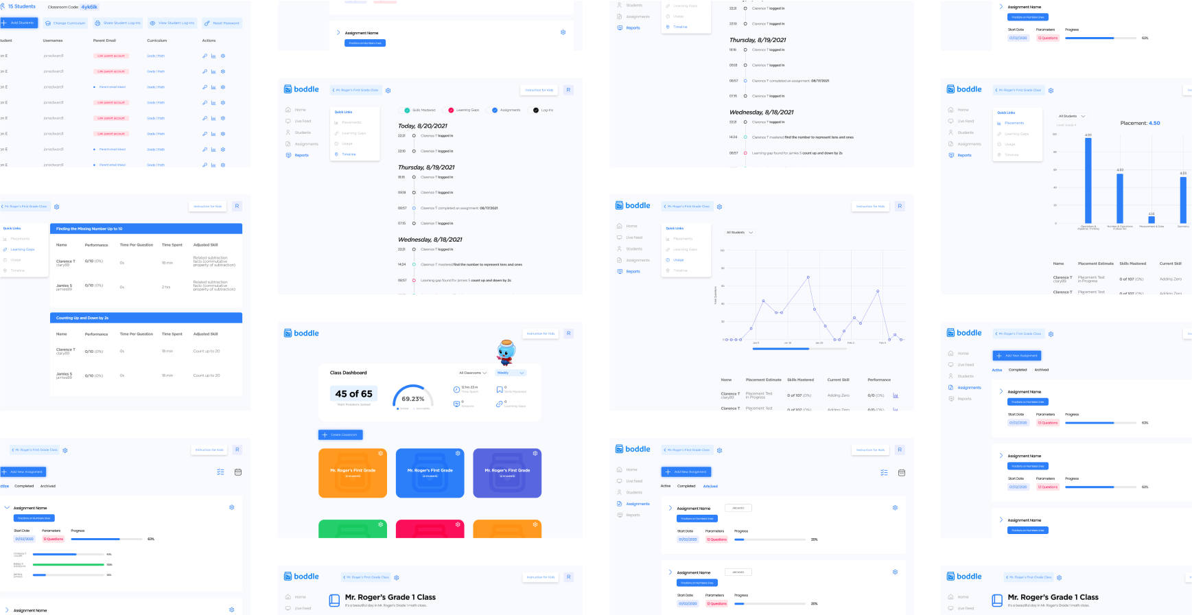
design system —
I started boddle learning’s first design system by using Boddle Learning’s branding guidelines and to create more of coherent designs.
Boddle Learning: Design System Case Study →interactive prototype —
Check through the interactive prototype from Figma.
next steps —
This work is still a work in progress. There’s a lot of inconsistent elements (for example the buttons are all over the place), don’t worry I know about them. If I had more time to work on this I would love to work out a design system to keep a constant design language throughout the website redesign and other products of Boddle Learning.
takeaways —
Collaboration
This was the first time I worked with a design lead and engineer which allowed me to understand different perspectives.
Feedback
Asking for feedback and questions on the design influences my design process. Since I was focusing on this one project after many smaller tasks, I was able to learn more about the Edtech/education industry.
Learning
I used this internship as a growing experience for myself. I enjoyed being able to create and architected the first design system from the bottom up and learn how other companies have their system set up. I’ve learned so much during this internship and about design and working in the “real world.”
If you would like to hear more about this project, please reach out!